Block Library
Headings
These are all the basic Heading blocks. If you want to add an eyebrow above one (see the text above the Header 2 example), place a Paragraph block above any Heading, and select the Eyebrow block style for the Paragraph.
Heading Number One
Some eyebrow text
Heading Number Two
Heading Number Three
Heading Number Four
Heading Number Five
Heading Number Six
Paragraphs
Extra Small: Etiam bibendum nulla erat, at accumsan sem hendrerit et. Donec mauris metus, finibus et nulla vitae, vulputate cursus quam. Vivamus aliquam mauris et odio rutrum porttitor quis in eros. Suspendisse elementum condimentum lacus quis egestas. Nam purus elit, mollis nec ante nec, porta scelerisque nisi. Proin et mollis nisi, et lobortis eros. Maecenas convallis fringilla enim, in varius nisi pharetra nec.
Small: Etiam bibendum nulla erat, at accumsan sem hendrerit et. Donec mauris metus, finibus et nulla vitae, vulputate cursus quam. Vivamus aliquam mauris et odio rutrum porttitor quis in eros. Suspendisse elementum condimentum lacus quis egestas. Nam purus elit, mollis nec ante nec, porta scelerisque nisi. Proin et mollis nisi, et lobortis eros. Maecenas convallis fringilla enim, in varius nisi pharetra nec.
Medium/Default: Etiam bibendum nulla erat, at accumsan sem hendrerit et. Donec mauris metus, finibus et nulla vitae, vulputate cursus quam. Vivamus aliquam mauris et odio rutrum porttitor quis in eros. Suspendisse elementum condimentum lacus quis egestas. Nam purus elit, mollis nec ante nec, porta scelerisque nisi. Proin et mollis nisi, et lobortis eros. Maecenas convallis fringilla enim, in varius nisi pharetra nec.
Large: Etiam bibendum nulla erat, at accumsan sem hendrerit et. Donec mauris metus, finibus et nulla vitae, vulputate cursus quam. Vivamus aliquam mauris et odio rutrum porttitor quis in eros. Suspendisse elementum condimentum lacus quis egestas. Nam purus elit, mollis nec ante nec, porta scelerisque nisi. Proin et mollis nisi, et lobortis eros. Maecenas convallis fringilla enim, in varius nisi pharetra nec.
X-Large: Etiam bibendum nulla erat, at accumsan sem hendrerit et. Donec mauris metus, finibus et nulla vitae, vulputate cursus quam. Vivamus aliquam mauris et odio rutrum porttitor quis in eros. Suspendisse elementum condimentum lacus quis egestas.
XX-Large: Etiam bibendum nulla erat, at accumsan sem hendrerit et. Donec mauris metus, finibus et nulla vitae, vulputate cursus quam.
Buttons
Solid/Primary
Outline/Secondary
CTAs
CTA (Thin)
Here is a small amount of text that is important
CTA Full Width
Title of the Page Goes Here
Etiam sed ex ac erat vulputate convallis. Integer vitae dui venenatis, molestie mi sed, convallis sapien. Nam maximus efficitur tellus nec rhoncus.
CTA (content width)
Title of the Page Goes Here
Etiam sed ex ac erat vulputate convallis. Integer vitae dui venenatis, molestie mi sed, convallis sapien. Nam maximus efficitur tellus nec rhoncus.
CTA (BG Cut Left/Right)
This is a single block found in the Pattern Library. Under the Block Settings, you can choose either Cut Left or Cut Right. Just make sure you move the columns around to be the right way. You can also change the background color using the normal block styles.

Large Title for Your Homepage Goes Here
Whether you’re looking to take your inventory, order or sales management to new heights, Apex Trading has the tools, features and integrations you need to get the job done.
Columns
Image Columns
There is a Pattern saved called Image Columns (note the plural of this block). This will create a grid of multiple single Image Column loaded in. You can then select the Image Columns container (aka. the “grid” that holds it all) and then select from the Block Styles how these columns should look on mobile (Scroll, 2-column, or 1-column)

Sample Headline Goes Right Here
Cras elementum ex faucibus, interdum orci vitae, venenatis tortor. Donec interdum pellentesque leo, et luctus mauris ornare id. Etiam sed ex ac erat vulputate convallis. Integer vitae dui venenatis, molestie mi sed, convallis sapien. Nam maximus efficitur tellus nec rhoncus.
Another Headline
Cras elementum ex faucibus, interdum orci vitae, venenatis tortor. Donec interdum pellentesque leo, et luctus mauris ornare id. Etiam sed ex ac erat vulputate convallis. Integer vitae dui venenatis, molestie mi sed, convallis sapien. Nam maximus efficitur tellus nec rhoncus. Etiam sed ex ac erat vulputate convallis. Integer vitae dui venenatis, molestie mi sed.
This one
Cras elementum ex faucibus, interdum orci vitae, venenatis tortor. Donec interdum pellentesque leo, et luctus mauris ornare id. Etiam sed ex ac erat vulputate convallis.
Linked Icon Pods
This is a custom block that can be found in the Pattern Library. At the top of the custom block, you can choose how many columns it has. There is a repeater that will allow you to upload an icon, title, and link. The entire pod is linked.
Icon Pods
There is a Pattern saved called Icon Pods (note the plural of this block). This will create a grid of multiple single Icon Pod loaded in. You can then select the Icon Pods container (aka. the “grid” that holds it all) and then select from the Block Styles how these columns should look on mobile (Scroll, 2-column, or 1-column). Once added to the page, you can go into the individual Icon Pod blocks and change the Background Color. When using a Font Awesome icon, we recommend using Duotone and Regular from the dropdown menus.
Icon List
Add a new block and select Icon List. This will drop a grid of simple Paragraphs that have Font Awesome icons next to them. You can select the parent Icon List to change the grid’s number of columns and how it formats on a mobile device. For your website, we recommend using Font Awesome’s Light style.
Icon Row
Grab this block in the Pattern Library. This is a full-width block where the icons are Font Awesome (recommended: Duotone Regular), an H3, and a description.
Simple Icons in this section
Here is a header text right here
Morbi tempus augue a diam luctus mattis. Ut nec lectus viverra, mollis lorem ac, mattis metus. Praesent rutrum vulputate lorem et rhoncus. Aliquam quis purus metus. Ut in rutrum ligula.
Here is a header text right here
Proin sit amet tincidunt enim, a dignissim libero. Aenean dignissim fringilla neque, in aliquet sem sodales ut. Praesent molestie velit eget neque dictum, sed aliquam orci efficitur.
Here is a header text right here
Proin porttitor augue non lectus accumsan tempus. Vivamus eros enim, consequat id blandit vitae, lacinia ac elit. Fusce suscipit nisl lorem, id aliquet odio porta at.
Hero Sections
Hero (Large Centered)
Select the block from the Pattern Library. This is a very versatile hero section for you. All of the available options are preloaded into this block, you’ll just need to remove what you don’t want.
- Icon: upload a transparent PNG to replace the existing icon with.
- Heading: The default heading is an H1 for the title of the page
- Paragraph: This is large, centered text for the hero’s description
- Button: A large button is already placed here.
- Background Image: a default image has been selected, but you can: remove it, swap it, or add a solid color by editing the Group’s Block Settings.
- Color Overlay: On the Block Settings, you can select BG Overlay. The selected background color will then be placed as an overlay on top of a background image. This works best when the image uploaded is full-color.

Large Title for Your Homepage Goes Here
Donec interdum pellentesque leo, et luctus mauris ornare id. Etiam sed ex ac erat vulputate convallis.
Hero (Mega)
Select the block from the Pattern Library. This block is automatically set to be full-width. Inside the hero, there is an H1 tag that is centered at the top. Then, there is a 2-column block that will allow you to drag anything you want into it. The image will go on the right, and any text/icon you want can go on the left. If you select the Hero (Mega) container group, you can edit the background image and overlay color under the Block Settings.
Large Title for Your Homepage Goes Here
Whether you’re looking to take your inventory, order or sales management to new heights, Apex Trading has the tools, features and integrations you need to get the job done.

Hero (Background Fade)
Select the block from the Pattern Library. To change the “fade” color, select the Group and change the Background Color under the Block Settings. This block can also be used as a CTA – just change the “Heading” at the top to an H2 tag.
Large Title for Your Homepage Goes Here
Donec interdum pellentesque leo, et luctus mauris ornare id. Etiam sed ex ac erat vulputate convallis.
Hero (2 Column)
Grab this block from the Pattern Library. This is a simple two-column layout that is customizable. There is an H1, description, and button in the left column. The right column has an image. If you edit the Block Settings of the Hero (2 Column) group, you can change the background color.
Big Page Title Goes Right Here
Cras elementum ex faucibus, interdum orci vitae, venenatis tortor. Donec interdum pellentesque leo, et luctus mauris ornare id.
Emphasis Text
Grab this from the Pattern Library. This is a full-width section that has large text to draw emphasis.
This is a pretty dope section to place some text that will hopefully draw some attention to this sentence, given that it’s a bit longer.
Testimonials
This is a custom block available in the Pattern Library. There are a few options to allow you to customize what testimonials are displayed here.
- Columns: How many columns should be displayed?
- Display: Do you want to select testimonials manually or by State?
- Selection: depending on the choice made in Display, you will have the ability to either manually choose testimonials or choose a State.
- Quantity of Posts: If you choose State, you can then choose the number of posts to show in the grid.
Post Grid

B2B cannabis software
Why We Took a Different Approach to the Tools Needed for the Wholesale Cannabis Industry When we first jumped into the B2B cannabis software space, we were thinking like a lot of folks – build a marketplace. We had backgrounds in wholesale cannabis as well as software development. What better could we do for B2B…
Read Post
Wholesale Cannabis Marketplaces – The Good, Bad and Ugly
The theme to Sergio Leone’s classic The Good, the Bad and the Ugly is almost as irresistible as a hot bath and a shave after weeks of drifting on the high plains. For some, that whistle is practically a siren song. The allure of an open wholesale cannabis marketplace can be just as appealing, with…
Read Post
Pay to Play – The Latest Mainstream Retail Practice to Hit Wholesale Cannabis Producers
Hot off the digital presses of Marijuana Business Daily from the mind of Margaret Jackson comes this thought-provoking piece around slotting fees for wholesale cannabis producers. We won’t spoil too many of the surprises, but it’s good to start gaining an understanding of how slotting fees work and getting them baked into your B2B cannabis business…
Read PostEvents List
Partner Card
This is a Gutenberg block and is completely editable. Add the Partner Card block to a page and edit the Image, and the two columns
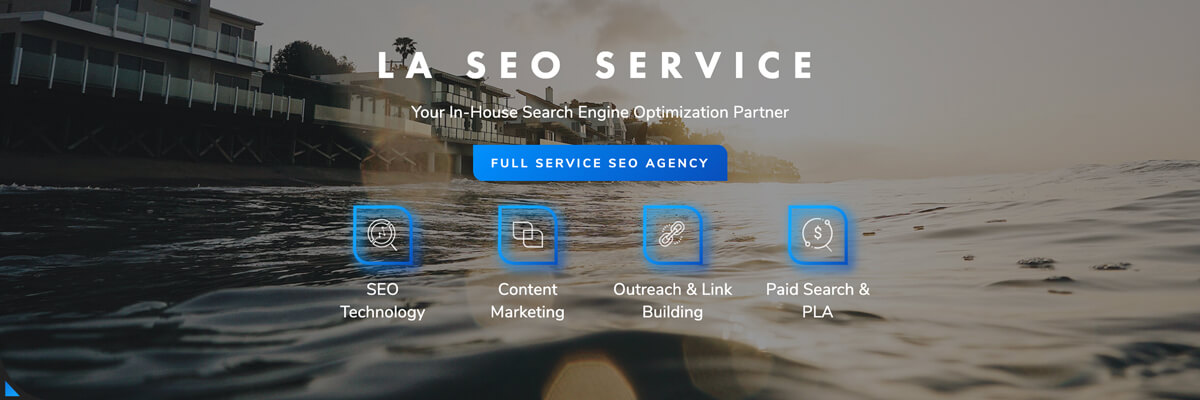
LA SEO SERVICE
CANNABIS-SAVVY SEARCH MARKETING AGENCY
LA SEO provides full-service solutions to help you grow your business via organic and paid search. With a specialized cannabis search marketing tactical team that defines what’s needed for growth while helping to execute the work for you.
- Paid search management of cannabis industry campaigns that perform within Google’s ad guidelines
- Site optimization leadership and execution which unlocks non-branded keyword Organic Search traffic and sales
- Content strategy, production and outreach link building support which expands the keywords you rank for while simultaneously boosting ranking position
- Custom web analytics dashboards that explain what’s working across marketing channels to drive new leads and sales
Logo Garden


State Sellers Pods
This is a Gutenberg block and allows you to add the seller pods for a specific state to any page. Grab the Seller Pods block and drop it on your page. On the right side block settings select the state you want to display sellers for. The drop down select only lists states you currently have sellers in (this data comes from your API weekly).


